T
Tuxedo Mask
Guest
Original poster
Hey all you artistic and creative Iwakuans out there!
So the reason for this post was that I need all of ya'lls opinions on a design for a flyer I'm making for the Denver blues dance scene. It's a contest in which if I win I get to go to a sweet blues dance event for free!
So please give me your critiques!
(I ask that the critique is on the overall design not the nit picky details please, though you can add those too :]] )
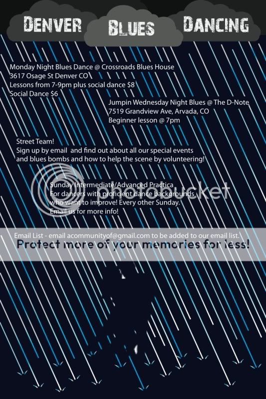