Anime and Fandom Group RP Sub Forum

Status
Not open for further replies.

Sir Salty

Big Daddy of Internet Culture
Original poster
FOLKLORE MEMBER
Invitation Status
Posting Speed
  1. Speed of Light
  2. Multiple posts per day
  3. 1-3 posts per day
Online Availability
No Life
Writing Levels
  1. Intermediate
  2. Adept
  3. Advanced
  4. Adaptable
Genres
Speculative Fiction, Fantasy, Sci-fi, Horror
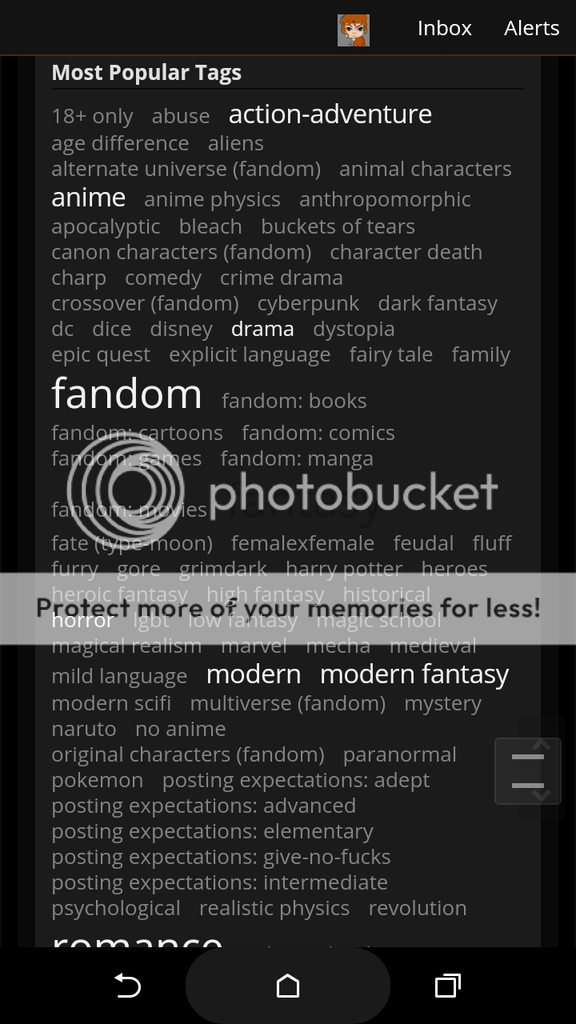
Look guys, I come from another RP site, I was hoping to come to Iwaku to find some fresh new ideas. And all I see in the Group RP forum is anime and fandom RPs. Or at least they are to me. And I have no problem with that. But I am looking for something that isn't those categories.

I feel like, so we can at least honor the GMs who want to do their own creative RPs, with their own written stories, that are more grounded. We should give the Anime and Fandom Group RPs their own sub forum, so the other RPs, aren't swallowed by the high activity of the Anime and Fandom Group RPs sign up.

Much like the way the Libertine is handled as a sub forum.

Just a thought.
 
If you are looking for something else, that's a great moment to start using the tags! You know, that massive wall of words at the top of every forum? Click one, and it will filter down to only the roleplays that contain that tag. If you aren't looking for fandoms or anime stories, filter out those tags. :D The Libertine forums have their own dedicated forum because they are age-locked, so that members don't smut with the wrong age group. The reason everything else is melded together into one forum is precisely so that we don't need sub-forums for every possible category, and the confusion that comes when they start overlapping. The tags are designed to allow people to search for exactly the content they want, which is why we have such a large collection of them. :D
 
I guess, but if you're anything like me. I forget to do the tags and such.
 
I understand. And it is also a new system, so people aren't really used to using it to search for roleplays yet. It might take a bit of time, but it should be a really easy system once people get used to it. :D At least, that's the hope.
 
Wait, I thought this was a temporary arrangement until @Diana can get everything sorted o.o Are all the groups going to stay grouped in the jumbled mess?
 
*shrug*
In order to open the site up as quickly as possible, we skipped putting the roleplays back in to genre categories and opted for a really, really basic type organization. Groups, One on Ones, and Chats. So you know EXACTLY where the fuck to post your roleplay thread. Later they are likely to return, but we're going to train the peerage in tags first cause they're useful!

Tag training. :D
 
Yeah but...

[Spoili]
Screenshot_2016-03-13-15-11-29.png
[/spoili]

Not only do the tags take up the entire screen on mobile, they're not organized, they come in a couple of different colors one of which is hard to see on the dark background, the different sizes are distracting, and the fact there's a whole cloud of them on top of the forum isn't really helpful.
They could be handled better for sure. I'd like to see them tucked away in an expandable menu thing that's closed by default, and making them consistent and logically organized would be nice too.

Also, a part of that quote Peregrine posted confirms your thought about it being a likely temporary arrangement: "Later they are likely to return."
 
  • Thank You
Reactions: Noctis the Devious
Yeah but...

[Spoili]
Screenshot_2016-03-13-15-11-29.png
[/spoili]

Not only do the tags take up the entire screen on mobile, they're not organized, they come in a couple of different colors one of which is hard to see on the dark background, the different sizes are distracting, and the fact there's a whole cloud of them on top of the forum isn't really helpful.
It's not just mobile. It takes up the whole screen on my laptop, too. @_@ Made me think it was a glitch the first time I saw it, and that the actual RP list just wasn't displaying for some reason. Took me a second to think to scroll down.
 
The tag system needs some tweaking for sure, but with adjustments for ease on the eyes (and mobile viewing) I believe it is a better system than subforums. At one point we had somewhere around ten subforums for the RP section, with some of these subforums having two or three threads, because people kept requesting an easier way to filter down to x genre. We also had a million thread prefixes that either no one used, were used incorrectly, or caused moderation/GM headaches trying to figure out which prefix best fit a thread. The biggest part of forum moderation involved moving threads that were misplaced in the incorrect subforum. (For example, even though we had a fandom subforum, people still posted their RPs in the other sections- the fantasy subforum in particular.)

Since we switched from the Roleplay Resources back to forum format and started promoting tag use, I have personally found it a lot easier to actually find RPs. Obviously, different people adapt at different rates, so it's understandable if other people are having some issues.

The organizational complaints- and wishing to filter out things you're not interested in- I get. But I don't really agree with your secondary reason for wanting the separation, which seems to be some notion that original plots are worth more than fandom ones. (In reference to where you say "I feel like, so we can at least honor the GMs who want to do their own creative RPs, with their own written stories, that are more grounded.") You cite the Libertine section as an example of where we've split things, but the reason Libertine/Liberteen is separated from the rest of the forum is to do with legal issues, not the legitimacy of the roleplays or for organization.
 
It shows fine for me, most of the screen still free for other stuff.

Though I got a 1920 x 1080 monitor, so it's likely just designed for big screens.
Something that'd let the size of the box scale to your monitor size might also work well.
 
It shows fine for me, most of the screen still free for other stuff.

Though I got a 1920 x 1080 monitor, so it's likely just designed for big screens.
Something that'd let the size of the box scale to your monitor size might also work well.
I dunno about that, because I've got a dinky little Acer Chromebook screen and I don't have any issues with the tags. o__o Not sure why it would be for others. On my phone, though, there's a good bit of scrolling involved.
 
I dunno about that, because I've got a dinky little Acer Chromebook screen and I don't have any issues with the tags. o__o Not sure why it would be for others. On my phone, though, there's a good bit of scrolling involved.
Operating System or Browser issues maybe?
 
It shows fine for me, most of the screen still free for other stuff.

Though I got a 1920 x 1080 monitor, so it's likely just designed for big screens.
Something that'd let the size of the box scale to your monitor size might also work well.
I dunno about that, because I've got a dinky little Acer Chromebook screen and I don't have any issues with the tags. o__o Not sure why it would be for others. On my phone, though, there's a good bit of scrolling involved.
Operating System or Browser issues maybe?
Here's what the group signups forum looks like on the size that I usually keep my browser.

Here's what it looks like when I full-screen it.

So, you can see what I meant when I said that it really threw me off, not being able to see the top of the actual RP list without scrolling. @_@ I'm really curious as to what it looks like on your ends if it doesn't look as large to you.
Oh, no, mine looks pretty much exactly like yours. I just only have to scroll down a little bit so it didn't really throw me off. o__o I was picturing something worse from what you were saying.

Maybe the tag cloud could go in a sidebar or something to help out the people who don't realize they need to scroll.
 
  • Like
Reactions: Gwazi Magnum
Oh, no, mine looks pretty much exactly like yours. I just only have to scroll down a little bit so it didn't really throw me off. o__o I was picturing something worse from what you were saying.

Maybe the tag cloud could go in a sidebar or something to help out the people who don't realize they need to scroll.
I mean, yeah, it's not that bad, and it didn't exactly take me long to realize that I needed to scroll, but... it's still kind of big and obnoxious, you know? It just feels like there shouldn't be so much junk that I have to scroll past an entire screen's worth of stuff just to see the RP list. o__o

Putting the tag list in something akin to a spoiler tab would yield a much cleaner look, I think. (...And, yeah, it would also be a huge help to people on mobile, who do have to do a ton of scrolling to get past it.)
Yeah, I also like Jorick's suggestion of a collapsible tag cloud. Just not sure how easy to implement that would be. @Diana could probably tell us.

The tag cloud is definitely untenable as is on mobile.
 
Oh, no, mine looks pretty much exactly like yours. I just only have to scroll down a little bit so it didn't really throw me off. o__o I was picturing something worse from what you were saying.

Maybe the tag cloud could go in a sidebar or something to help out the people who don't realize they need to scroll.
[2] I have the same size myself.
I assumed it was some big entire-screen occupying mess from other's descriptions though.
Putting the tag list in something akin to a spoiler tab would yield a much cleaner look, I think. (...And, yeah, it would also be a huge help to people on mobile, who do have to do a ton of scrolling to get past it.)
Yeah, I also like Jorick's suggestion of a collapsible tag cloud. Just not sure how easy to implement that would be. @Diana could probably tell us.

The tag cloud is definitely untenable as is on mobile.
I also agree with this though. Organizing it and being able to hide it would be nice.
 
I think they all should be the same size and color too. When your looking for a tag for a roleplay - as those like me who don't know what tags are available to them for their roleplay look at that huge tag cloud for options - you're not looking for the most popular, you're looking for the ones best suited for your roleplay. I think it's the same for people looking for a roleplay. You don't want to look for the most popular, you want to look for the tags that best suit your interest.
 
  • Like
Reactions: Kagayours
I think they all should be the same size and color too. When your looking for a tag for a roleplay - as those like me who don't know what tags are available to them for their roleplay look at that huge tag cloud for options - you're not looking for the most popular, you're looking for the ones best suited for your roleplay. I think it's the same for people looking for a roleplay. You don't want to look for the most popular, you want to look for the tags that best suit your interest.
^ That's a very good point. Not to mention, it just looks awkward, having all those different font sizes.
 
  • Like
Reactions: Noctis the Devious
Status
Not open for further replies.