ADMINS USERGROUP COLOR VOTE FINAL ROUND

Which yellow would you like for the Admins?


  • Total voters
    229
  • Poll closed .
Status
Not open for further replies.

Diana

LOOK HOW CALM SHE IS
Original poster
ADMINISTRATOR
MYTHICAL MEMBER
Invitation Status
  1. Not accepting invites at this time
Posting Speed
  1. 1-3 posts per week
  2. Slow As Molasses
Online Availability
10AM - 10PM Daily
Writing Levels
  1. Adaptable
Preferred Character Gender
  1. Female
Genres
Romance, Supernatural, Fantasy, Thriller, Space Exploration, Slice of Life
WOW THANKS

You chose yellow for the Admins. >:[ How delightful.

Well, here are your Diana-approved selections of yellows and golds. 8D It doesn't matter which you pick, because yellow sucks and we're all going to hate it. At least choose one that matches the palette we have going on already.
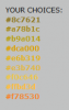
YOUR CHOICES:
#8c7621
#a78b1c
#b9a014
#dca000
#e6b319
#e3b740
#f0c646
#ffbd3d
#f78530


THE PREVIOUS WINNING COLORS:

Newbies Color
Members Color
Donators Color
Volunteers Color
Staff Color
 
I like the softer shades :3


No orange for you >:[
 
We just wanted you to glow like the sun :D
 
  • Love
Reactions: xLarius
Brighter yellows. They match the other colors. And I want you to suffer. >:) #HailtheQueenintheNorth
 
The last one isn't too eye-bleeding inducing.
 
I voted for the best one obviously :P
 
wwaaaatttt I am extremely upset that the red went to the staff instead of the admins. >:[
 
Soft. Like a pancake.
Dang do I love majority votes.
 
wwaaaatttt I am extremely upset that the red went to the staff instead of the admins. >:[

It's actually more of a hot pink than a true red xD
 
  • Like
Reactions: Kitti
Theme: Grey Mist.
Acceptable Contrast:
#8c7621
#a78b1c
#b9a014
#f78530

Marginal Contrast:
#dca000

Poor Contrast:
#e6b319
#e3b740
#f0c646
#ffbd3d

Just something to keep in mind for when you switch everyone's bgcolor to #c0c0c0.

The attached image actually makes the contrast look a lot better than it actually is.
 

Attachments

  • hmm.png
    hmm.png
    3.5 KB · Views: 19
Theme: Grey Mist.
Acceptable Contrast:
#8c7621
#a78b1c
#b9a014
#f78530

Marginal Contrast:
#dca000

Poor Contrast:
#e6b319
#e3b740
#f0c646
#ffbd3d

Just something to keep in mind for when you switch everyone's bgcolor to #c0c0c0.

The attached image actually makes the contrast look a lot better than it actually is.
On the flipside of things, here are the codes as they would look on the grey of the default style.

cKdmT7V.png


Only #8c7621 and #a78b1c have bad contrast on that, with #b9a014 being a borderline case; the rest is perfectly visible to me. As for #F78530: that's not a yellow :P

EDIT: actually, with a larger image, those two colors have decent contrast too. Conclusion: Switch to the default style to solve all your problems :P
 
  • Nice Execution!
Reactions: Jorick
Also, here is a side-by-side comparison of all the colors as they would look when they're actually used for names to the left:
Qg2Ddd2.png


Because I had nothing better to do :P
 
  • Useful
Reactions: Ali and Jorick
I'll vote for the top option because it's the closest to the color of shit.
 
I'm guessing most people who votes use darker shades for their forum style. I chose the third option since it was the easiest to read on Grey Mist.
 
To be honest, gray background users are more of a minority I think. Unless something has changed the majority of site users either use black or white backgrounds :)
 
Both of those colours are too strenuous on my eyes to be honest. ^.^
 
Reject the extremists who would force their contrast onto you!

Choose the purity of grey.

Grey Mist.
 
  • Love
Reactions: Greenie
Status
Not open for further replies.